MedLaugh accidentally began in a surgical intensive care unit in Chattanooga, Tennessee. That night, around 4 a.m. a nurse decided she had had enough and was going to go home. Nothing said or done could really cheer her up. So, Carl Shrader, the founder, decided To sketch a little cartoon, make this nurse a “Star” in it, and post it where she could see it. Needless to say, that nurse finished her shift and came back for a whole bunch more! Thus, the birth of MedLaugh! The founder set out to create comical medical narratives that depict and reflect on the very profound experiences that healthcare workers go through on a daily basis, portraying their renowned triumphs and stressful challenges. The comics represent a beacon of hope, bringing about a catharsis through whimsical engagement and whit. After all, laughter is the best medicine.
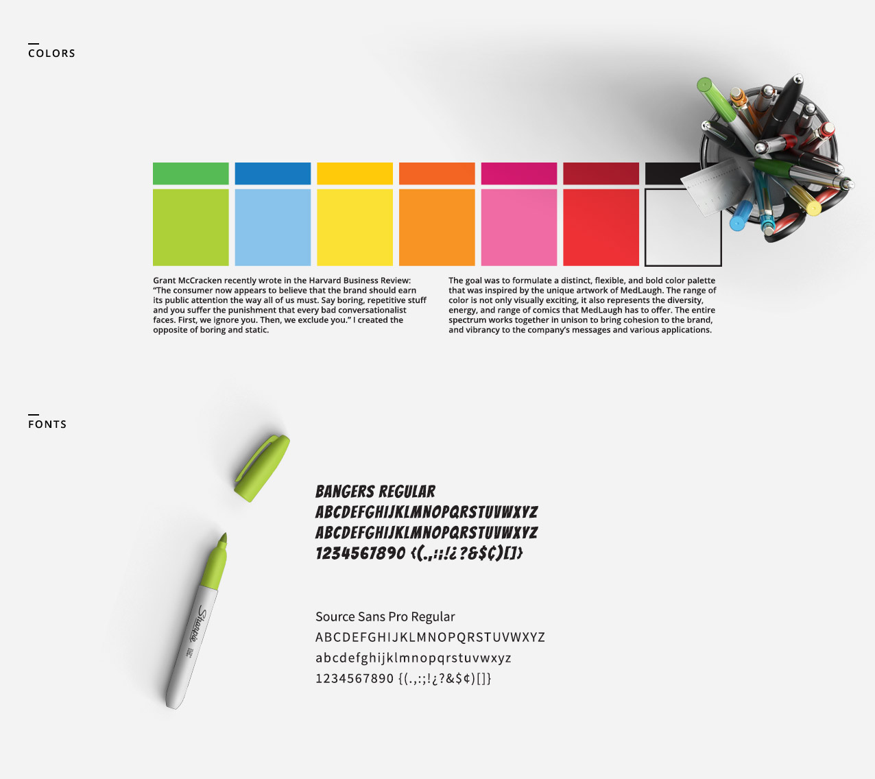
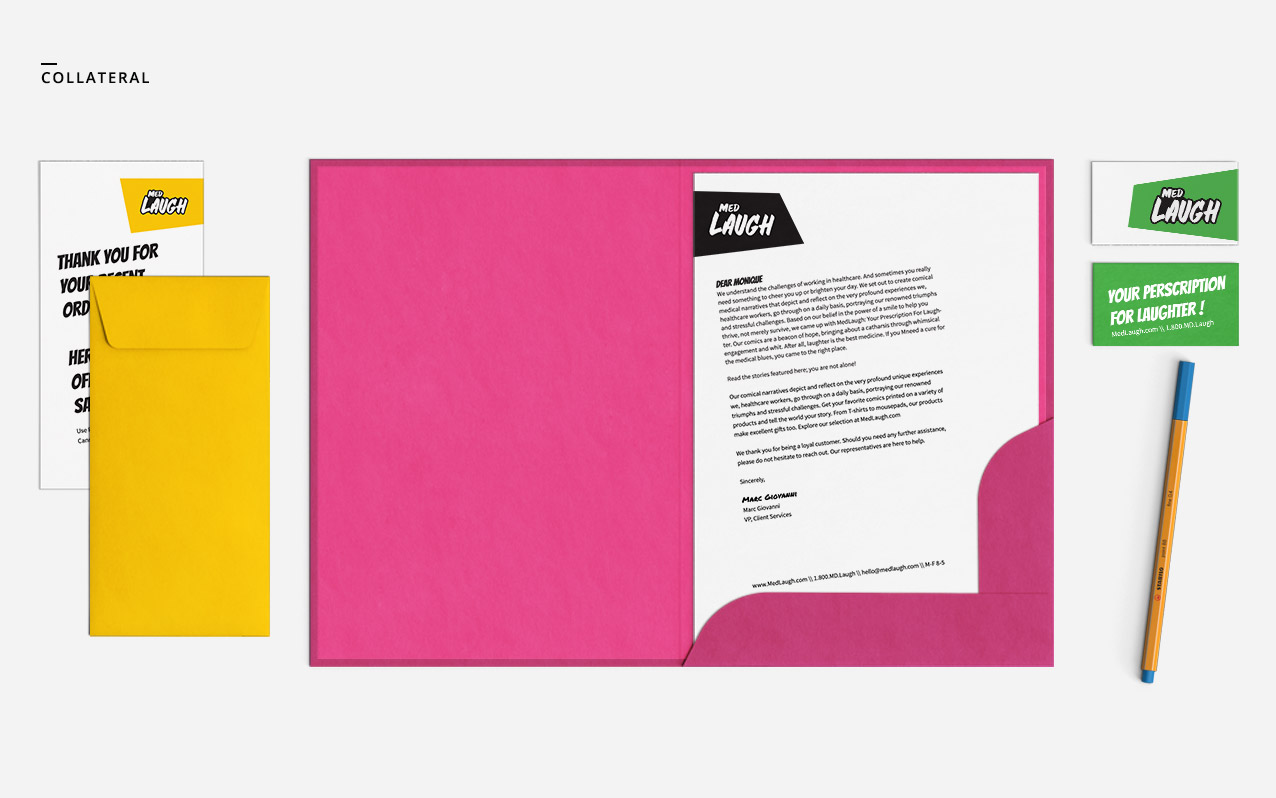
The goal was to come up with a robust brand visual language that is endlessly adaptable, flexible and immediately recognizable. For the logo, we created a fun, colorful, and creative solution using a uniquely hand-drawn typeface that gives a fully authentic look. The only constant is the name and typographic treatment of MedLaugh, while the containing shape (if used) in the background changes flexibly. This fresh approach to defining a brand’s visual identity is liberating and it stems from the ability to be flexible while keeping intact the core principles and attributes that form the brand in the first place. After all, the best way for a company to differentiate itself is to bend when every other brand is trying too hard not to break, and to embrace the principles of variance and fluidity.
Agency: KREATIVE | Comics: MedLaugh


